Design System: Iconography
Visual Design

As India’s leading fantasy sports platform, engaging millions of fans during high-stakes match moments, Dream11's existing visual language — from iconography to illustrations — had grown outdated and disconnected from where the brand was heading. It had become overly transactional and functional, failing to match the brand’s dynamic direction and missing the opportunity to build an emotional connection and capture the true passion of the game.
Client:
Dream11
Role:
Product Illustrator
Year:
2022-2025
Explore the full story –
The Problem
The existing design style didn't resonate with Dream11's brand identity or its five core principles — Exciting, Competitive, Simple, Sporty, Trust. As the product scaled, icons and illustrations had been built as one-offs over time, with no shared visual language, no documented system, and no way for teams to move quickly or maintain consistency.
The Goal
To redesign and systematize Dream11's iconography and illustration library — translating the brand's new visual identity into a scalable, documented system that any team in the organization could use and maintain independently.
The Solution
Led the end-to-end redesign of ~150 icons, built in parallel with ongoing feature work. Delivered a tokenized Figma library with naming conventions, grid rules, and stroke-weight documentation — enabling faster production and app-wide updates without manual rework.
The Approach

1. Discovery & Design Principles
Conducted stakeholder interviews and internal kickoffs to finalize 5 core design principles (Exciting, Competitive, Sporty, Simple, Trust) out of broader business objectives. This gave all teams (Design, Product, and Tech) a shared language to align on before a single icon changed. This step mattered more than it might look. In a fast-moving org with multiple squads shipping in parallel, a shared principle set is the only thing that prevents a system from drifting the moment you hand it over.
Brand Principle | What it means visually | Icon Property |
|---|---|---|
Sporty | Energy, Dynamism | High Contrast, Bold Strokes |
Simple | No clutter, clarity | Single metaphor icons, minimal detail |
Trust | Familiarity, legibility | Consistent weight, optically balanced |
2. The System Rules
Every visual decision in the Dream11 icon set follows a documented rule. What follows is the system behind the icons — the constraints that made consistency possible at scale.
→ Grid & Keylines
→ Stroke weights & optical corrections
→ Fill vs. outlined states (and when)
→ Naming & token architecture
→ Corner radius decisions

2A. Grid & Keylines
Icons are built on a 24pt base grid. The live area of an icon is the region where its main visual elements reside. This area should be impactful and well-balanced to ensure the icon is clear and recognisable, even at smaller sizes. Padding refers to the space around the icon's elements. The 2pt padding zone on each side isn’t decorative; it ensures icons don't appear cramped inside UI components with tight backgrounds, and that they scale predictably across sizes.
Keyline shapes — circle, square, portrait rectangle, landscape rectangle — act as optical anchors. A cricket ball icon is built to the circle keyline. A scoreboard icon is built to the landscape rectangle. Both feel the same visual weight in a navigation row, because they're calibrated to the same reference geometry — not the same bounding box dimension.

2B. Stroke weights & optical corrections
Dream11's icon set uses a 24px base grid with a 1.5px centre stroke weight. We explored multiple stroke sizes and finally arrived at 1.5px. This stroke weight was scalable across the product's data-heavy screens without overwhelming the information density around it. Icon sizes scale across 12px, 16px, 20px, 24px, 32px, and 40px within the UI. Mathematically scaling a 24px icon to 16px produces strokes that are too heavy for the smaller context. The correction is small — 0.5pt — but the difference in a dense list row is visible and meaningful.
Stroke weight scales with them — but not mechanically. Each size gets an optically corrected weight to preserve legibility:
Icon size | Stroke weight |
|---|---|
16px | 1pt |
20px | 1.25pt |
24px | 1.5pt (base) |
32px | 2pt |
40px | 2.5pt |
2C. Fill vs. outlined states
The product's screens are data-heavy. Bold outline icons at small sizes compete with the information they're meant to support — so the baseline was 1.5px stroke-weight outline icons. We needed to ensure that the icons are scalable & legible across the product.
Interactive states used brand colour outline icons. Fill icons were reserved for special product features or high-emphasis moments — but even here, colour wasn't a free variable. The Dream11 design system had pre-assigned colours to specific tasks and categories. Each colour already carried meaning. Introducing new icon colours arbitrarily would have created confusion in the UI hierarchy.
So the rule became simple: icons are black or brand colour by default. Feature-specific icons get colour case-by-case — line or filled — always within the defined palette. The system is quiet when it needs to be, expressive when the moment earns it.
2D. Naming & token architecture
Because this was a live production app, the new icon design system had to strictly follow our existing naming conventions and token structure. This ensured a smooth, error-free migration for current assets and established a consistent, maintainable format for all future icons.
2E. Corner radius decisions
1.5px for standard paths, 3px for larger forms — these were the two corner-radius values fixed for the Dream11 icon set. The previous icons had sharp ends. They read as dated — technically functional, but carrying none of the energy the brand was moving toward. Rounded corners and rounded edges shifted the feel: modern, confident, approachable. Still sporty. Still precise. But no longer cold.
During benchmarking, we found that the majority of category-leading brands had moved to this rounded style — and the emotional register it carried mapped directly to the Trust and Sporty principles we were designing toward. The decision wasn't an aesthetic preference; it was brand alignment with visual evidence behind it.
The Process
1. Benchmarking & Direction Setting
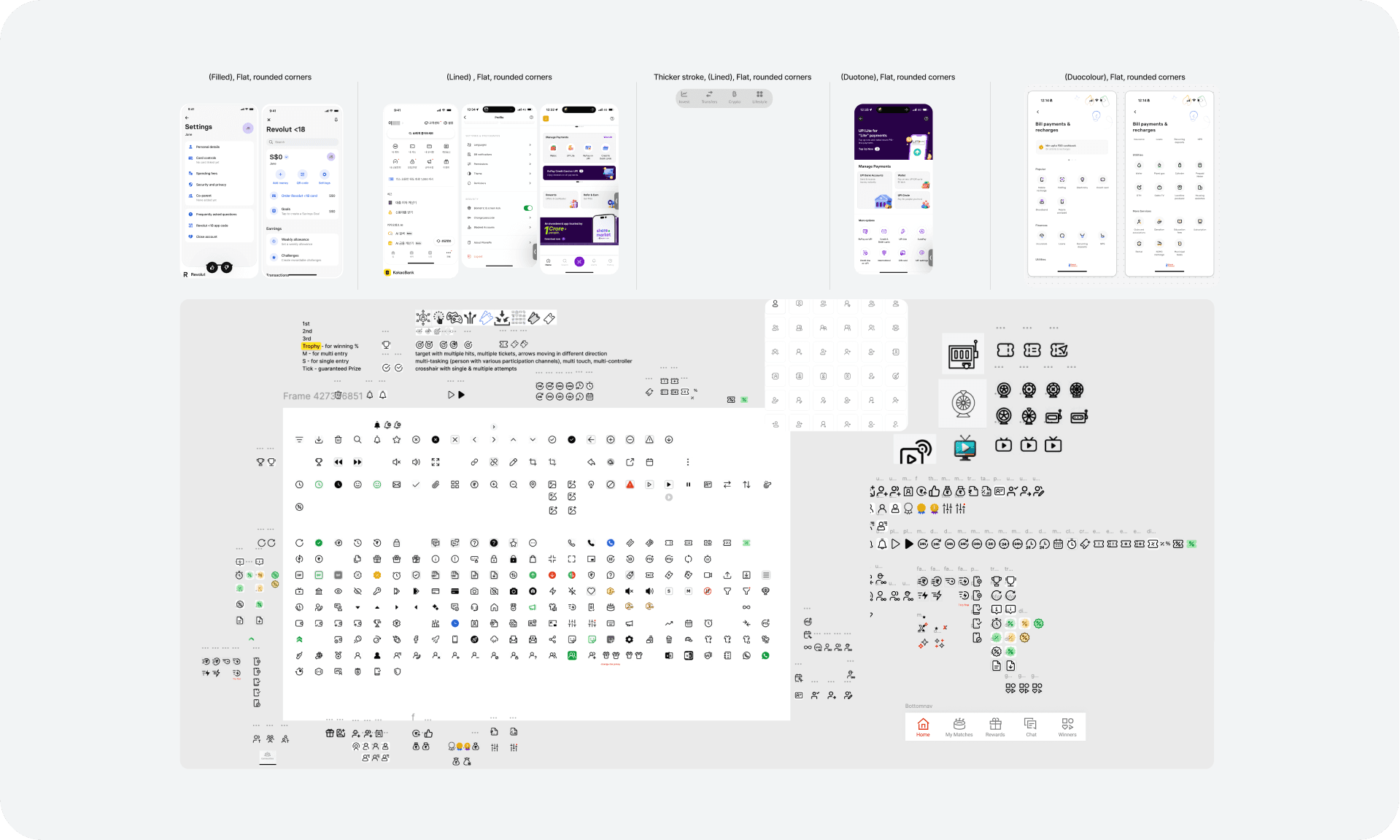
We benchmarked competitor products and category leaders, built moodboards across several visual directions, and stress-tested each against the five brand principles. The challenge wasn't finding a style that looked good — it was finding a style that felt sporty and exciting at small sizes while remaining legible in data-heavy contexts. Several directions we explored read well in isolation but lost their energy at 16px. The final direction emerged from a constraint: it had to work hardest at its smallest.
2. Conceptualisation of Icon Design
The system rules define what's allowed. The conceptualisation process is where each icon earns its place within those rules. For every non-obvious icon, the process followed the same sequence:
Identify the clearest metaphor → Reduce it to its simplest, honest form → Test it against the grid → Validate at the smallest target size.
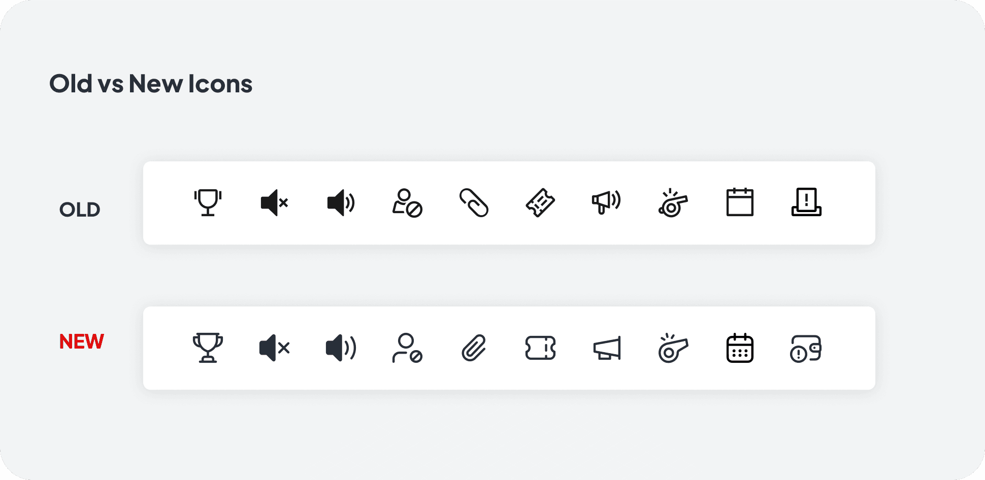
Here are a few old vs. new icons that illustrate the decisions behind the system:
3. Building the system
Once the direction was validated, we built out the full icon set — approximately 500–750 icons across all categories, sizes, and states. The build wasn't sequential. Icon design ran in parallel with ongoing feature work, which meant the system had to be robust enough for other designers to use before it was fully complete. Naming conventions and grid rules were documented and shared early, so that teams could adopt incrementally rather than waiting for a full handover.
4. Documentation & rollout
Documenting the system was as important as building it. A design system that lives only in the original designer's head isn't a system — it's a dependency.
Deliverables for handoff:
Naming conventions and grid documentation (written, in Figma)
Stroke weight and corner radius rules per size
Illustration guidelines covering hero and spot formats
A published Figma component library with variants and auto-layout
A handoff walkthrough for the teams inheriting the system
The measure of success wasn't the quality of the icons. It was whether another designer could open the library, understand the rules, and ship something on-brand without asking me a single question.
The Impact
Dimension | Outcome |
|---|---|
Scale | ~700 icons across the app |
Adoption | Rolled out across multiple product teams org-wide |
Production speed | Faster turnaround via documented system + Figma library |
Brand alignment | Visual language shifted from transactional to sporty/exciting, matching new brand principles |
Reception | Positive feedback across the organization on brand resonance |