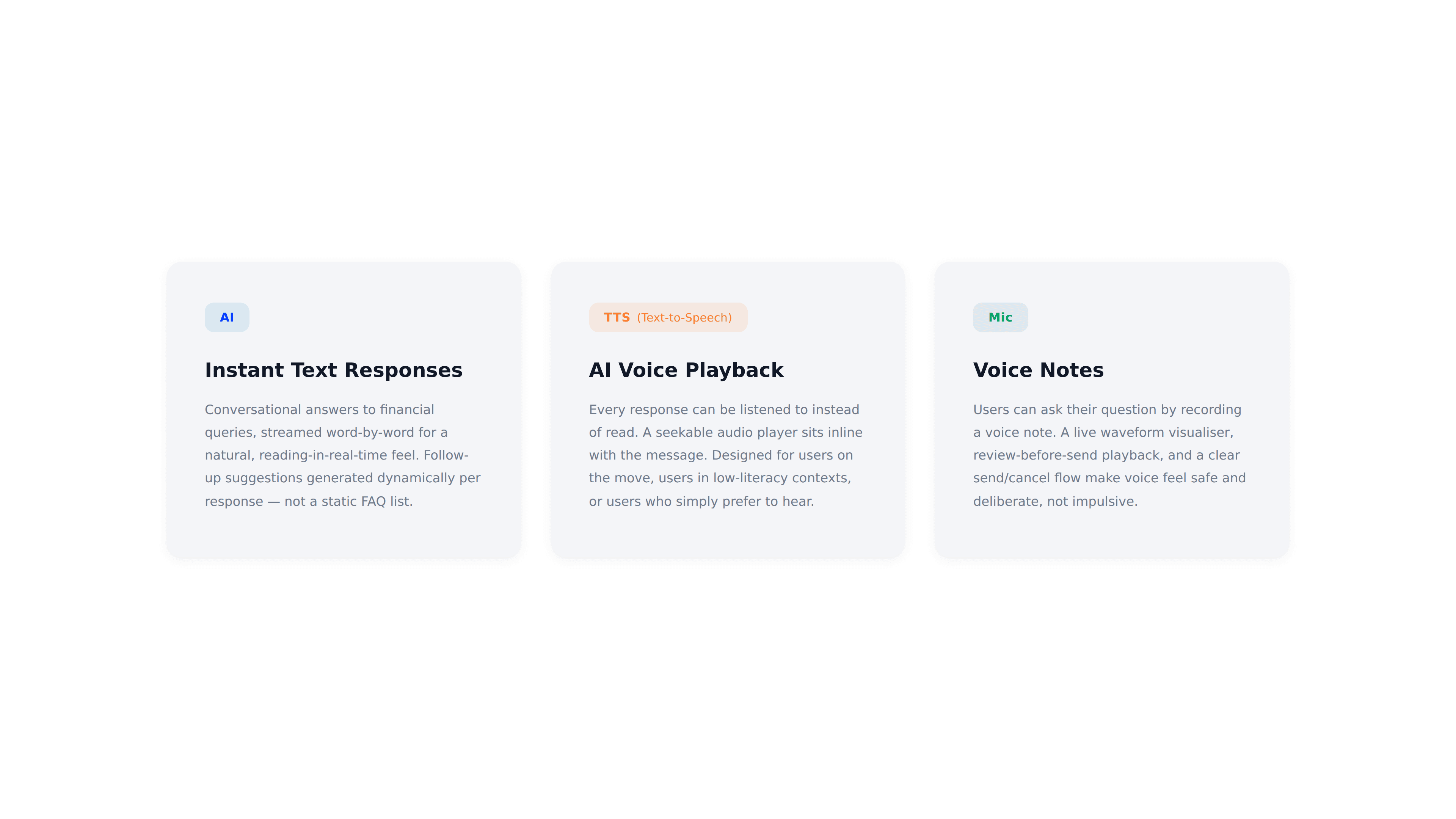
The Process
1. AI Persona — Designing MoneyGuru's Character
Before a single screen was touched, the AI needed a defined character — a voice, a boundary, and a presence that would govern every response and interaction.
1a. The Persona
MoneyGuru is DreamMoney's embedded financial guide — calm, non-intimidating, and designed to meet first-time investors exactly where they are. It answers factual queries like "What is a Liquid Fund?" or "How do I start a SIP?" in under ~5 seconds. No transactional advice. No portfolio recommendations. Strictly SEBI-compliant.
1b. Trust Is Built In, Not Earned
A disclaimer surfaces before any interaction begins — transparency is the default, not an afterthought. A distinct welcome message signals from the first moment that this is a different kind of experience within the app.
1c. No Blank Screens. No Dead Ends.
Users don't need to know the right question to ask. Pre-populated contextual queries in a ticker give them a starting point before they've typed a word. Every response is followed by a few follow-up suggestion chips that auto-send on tap — nudging users toward the next relevant question before they have to think of one — the result: continuous, contextual conversations that flow naturally.
1d. It Listens Both Ways
Thumbs up / thumbs down on every response turns the experience from a search bar into a dialogue. Feedback is frictionless, making users feel heard — not just served.
1e. Designed for Real Users, Not Ideal Ones
Plain English responses (Hinglish planned for Phase 2). No assumed financial literacy, optimised for all devices. Every answer: 60–120 words, ends with a nudge toward the next in-app step, and mirrors the user's own language to keep them in flow.
2. Information Architecture

3. Low-Fidelity Wireframes — Pencil
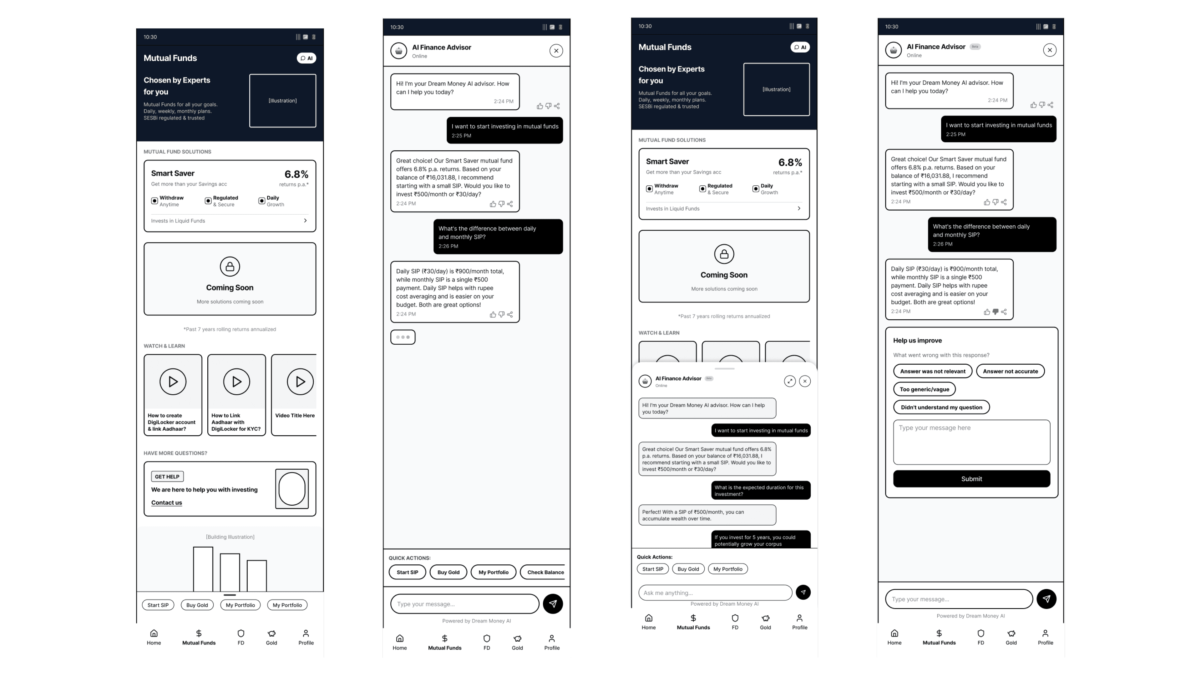
Given the time constraints and lean team, I needed to move from concept to structure without a lengthy sketching phase. I used Pencil — an AI-powered, agent-driven design canvas built around an open design format. The tool worked as a creative collaborator: I could prompt it to explore new directions, generate variations of the same screen, and quickly visualise alternate user journeys — all without committing to final aesthetics prematurely. This let me stress-test information hierarchy and flow logic early, at a pace that the project’s timeline demanded.
The MoneyGuru design journey was structured in two phases:
Phase 1 — Text Chatbot (Internal POC)
Covered the core AI chatbot with text-based chat functionality, initially built as a POC for Dream11's internal users (known as Sportans), covering only Mutual Fund-related queries. The entire text chatbot flow (Phase 1) was wireframed end-to-end:
Home screen entry points (FAB + inline prompt ticker)
Chatbot empty state with pre-populated suggestion chips
User text input states
Bot response states (text, loading, feedback controls)
Text-to-speech (TTS) player states
Error and edge case screens
Phase 2 — Voice Integration + External Redesign
Introduced voice functionality as an additional interaction mode, followed by a full redesign of the experience for external Dream Money users — a broader, less tech-savvy audience.
4. Establishing a Visual Identity
To seamlessly integrate MoneyGuru into the existing DreamMoney application, I designed a cohesive three-screen architecture which included —
Home Screen
Hero Welcome Screen (AI entry point)
Chat Interface
To signal a fresh & intelligent feature launch, I leveraged a modern, refracted glassmorphism effect on the welcome screen to visually elevate the AI entry point and refresh the overall look of the app. Also, I standardised component styles, spacing, and typography across all screens for systemic consistency.
Design Principles
Five principles defined the design language from the start — anchoring decisions from the FAB interaction to typography choices:
Simplicity — reduce cognitive load at every step; if a screen needs explanation, reconsider the design
Human — warm and direct, never transactional; the AI should feel like a knowledgeable friend, not a product feature
Trusted — every visual cue reinforces credibility and transparency; no dark patterns, no ambiguity in states or micro-copy
Playful — a deliberate touch of personality and delight, balanced carefully against the gravitas of financial decisions
Bharat Ready — designed for real Indian users across contexts: text + voice functionality by default, familiar interaction patterns, no assumption of financial literacy or a premium device
5. High-Fidelity UI Design — Figma
Every screen, every interaction state, every component variant was defined in Figma before a single line of code was written. The Figma file was the single source of truth throughout — for design review, for the Storybook build, and for directing the prototype.

6. Voice Experience Design
Voice was a central part of this project, so I designed it as a complete end-to-end experience. I designed the full voice recording flow as a bottom sheet with a live waveform visualiser. It has a preview state to re-listen to the audio input before sending it. Voice notes include a review state — listen back before sending. This removes the anxiety of accidental sends. For users who aren't confident in English, this felt essential. Send or Delete options are also available to keep users in control.
For voice outputs (Text-to-Speech), I designed full audio controls—including a scrubbable progress bar, clear play/pause states, and rules to prevent overlapping audio. I guided these user experience decisions, while Claude Code handled the technical build behind them.
7. Design System & Component Architecture in Storybook
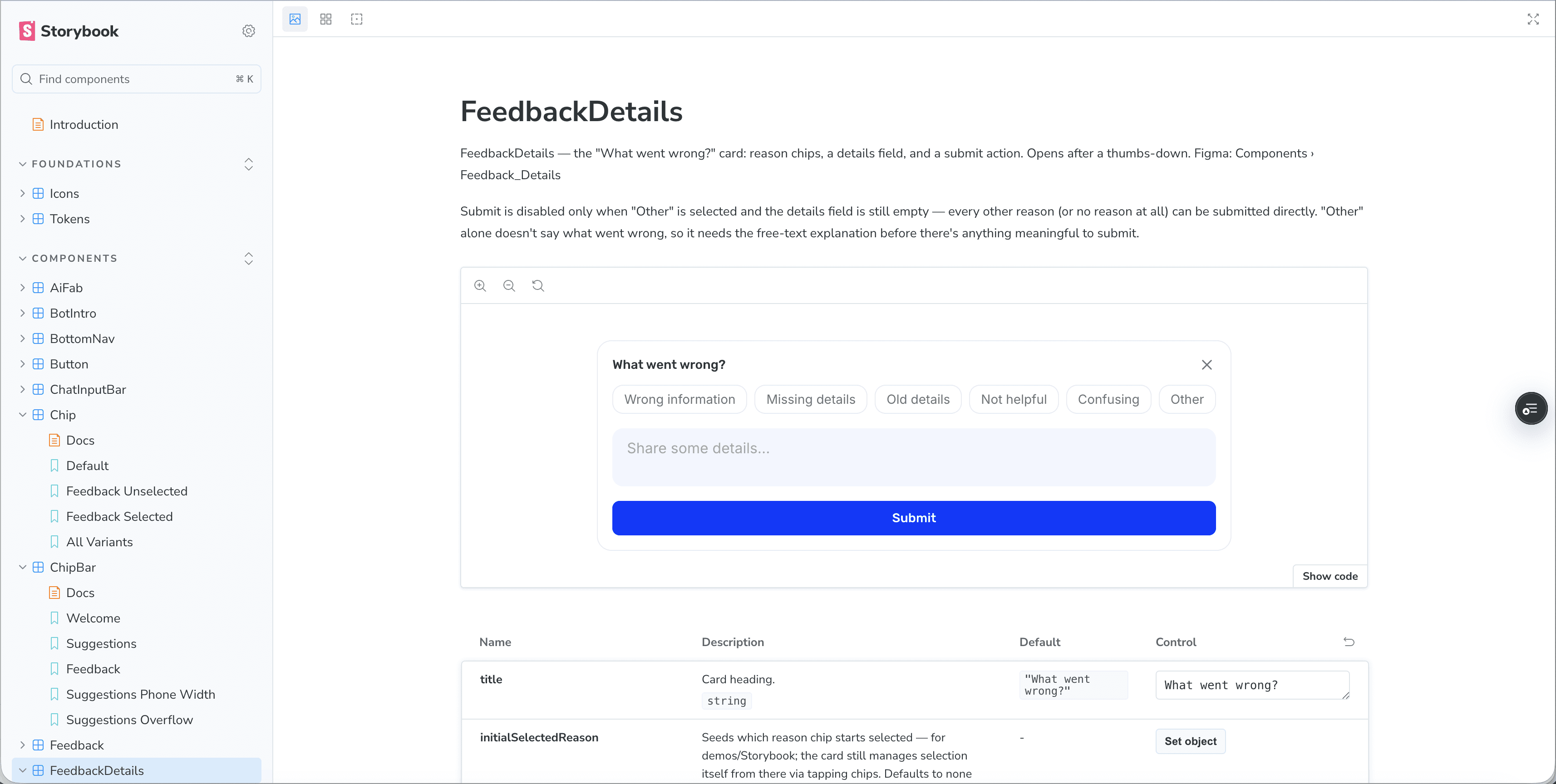
Once the Figma designs were fully resolved, the component library was extracted into a documented Storybook — establishing the system that would govern every screen state of the prototype and serve as the engineering handoff artifact.
Every component is documented in Storybook — from button states to voice recorder variants. Explore the full system → moneyguru-ds.juliescaria.com
Design Token Pipeline
I established a design token pipeline using CSS custom properties for colour, spacing, radius, and typography. No hard-coded values anywhere in the system. If a colour changed, it changed everywhere — consistently, instantly. This is what maintained global visual consistency across the entire ecosystem.
Notable Layout Decision
For the welcome state suggestion chips, I designed a single horizontally scrollable row rather than a wrapping grid. This intentional layout choice minimised visual clutter near the input bar — transforming the experience from a static form into a fluid, conversational interface.
Published as an npm Package
The design system wasn't just documented — it was published as a real npm package on GitHub Packages. Every component rendered in the prototype comes from the package directly. This closes the loop between the design system and the product.
8. Testing Visual Parity
I tested every design detail on physical mobile devices rather than relying solely on browser previews. If an interaction felt off on a real phone screen or two animations competed for attention, I refined or removed elements to protect the user experience. To validate my designs & the prototype, I ran quick usability tests, gathered direct feedback, and continuously iterated to polish the overall MoneyGuru experience.
9. AI-Assisted Prototyping - Claude Code
With the design system in place and every screen resolved in Figma, I built the prototype using Claude Code.
The Workflow
I described what I was seeing in my Figma designs, specified the interaction behaviour I wanted, compared Claude's output against my designs, and directed corrections until the prototype matched the canvas exactly. Claude handled all technical implementation; I kept all design decisions. The Figma MCP integration meant design context — exact token values, variant structures, state definitions — could be pulled directly from the source file into the prototyping session — no manual spec-copying. No eyeballing. Design intent stayed attached to its Figma origin.
Prototype Architecture
Phase 1 — Single HTML file
Phase 2 — Full React Application
Once the core experience was validated, I rebuilt the prototype as a React application. The rebuild wasn't just a technical upgrade — it was a structural one. The design system I built in Storybook was published as a real npm package. Every component on screen came from the package. No one-offs, no copy-paste.
What’s Next
User testing on the investment funnel drop-off hypothesis
The prototype validates the interaction model. The next step is testing it at an actual funnel drop-off point — KYC, fund selection, or first-investment confirmation — to measure whether the AI intervention meaningfully changes users' confidence and completion rates.
Compliance and accuracy layer
The system prompt currently constrains replies to 60–120 words and keeps tone warm and concise. For a production finance context, that needs to expand to a full guardrail system: factual grounding, regulatory disclaimers, and SEBI-compliant response boundaries.
Multilingual voice support
The voice modality was designed to lower barriers for users who struggle with English or typing. That promise only lands with multilingual TTS and ASR — Hindi, Tamil, Marathi at minimum for the Indian fintech context this product targets.
Handoff to engineering
The design system is already a published npm package. The bridge to a production engineering team is shorter than typical — the token system, component API surface, and Storybook documentation are all in place. What's missing is a production backend, authentication, and analytics instrumentation.
The full prototype is live — Check out the interactions with real AI responses. Explore it at moneyguru.juliescaria.com