Design System: Hero & Spot Illustrations
Visual Design

Dream11 is India's leading fantasy sports platform, engaging tens of millions of fans during the most high-stakes moments in cricket. As the product scaled, its visual language hadn't kept pace — illustrations were inconsistent, repetitive, and emotionally flat, failing to match the energy of the brand or the passion of its users.
Client:
Dream11
Role:
Product Illustrator
Year:
2022-2025
Explore the full story –
The Problem
Dream11's illustrations were built as one-offs — no shared visual language, no documentation, no system. The same generic visuals were reused across unrelated contexts, making it hard for users to tell which page they were on or what an error meant. During peak IPL traffic, this became critical: millions of users couldn't distinguish between a server error, an empty state, or a connectivity issue. The visual system was creating confusion at exactly the moment trust mattered most.
The Goal
To redesign and build a robust, scalable illustration system — translating Dream11's brand identity into a documented Figma library that any team in the organisation could use and maintain independently, with enough contextual variety to serve every state in the app.
The Solution
Led the end-to-end redesign of 50–60 hero and spot illustrations, built in parallel with ongoing feature work. Delivered a tokenised Figma library with consistent visual language, naming conventions, and documented visual rules — giving every app state a distinct identity and enabling teams to scale illustration production without manual rework.
The Approach
1. Discovery & Stakeholder Alignment
As an illustration team, we took the initiative to conduct stakeholder interviews and internal kickoffs to understand why illustrations matter in the product context. This gave every team member a shared understanding of the problem — not just aesthetically, but strategically. The root problem analysis confirmed that existing illustrations didn't match the brand's energetic voice, felt transactional rather than emotional, and lacked the consistency needed to scale. We needed a visual style that aligned with the brand & added delight to the app.
2. Why Illustrations Matter in Product Design
Illustration is an eye-catching medium that tells a story in a way that photography, diagrams, and icons cannot. We aligned the team around five clear reasons to invest in this work:
Establishes trust and credibility in the product
Simplifies complex ideas and communicates them at a glance
Improves user engagement and emotional resonance
Enhances and elevates surrounding content
Builds brand identity — adds personality and makes the product memorable
3. When to Use Product Illustrations
Not every screen needs an illustration. We documented clear criteria for when illustrations earn their place:
Explaining Complex Concepts — Simplify onboarding flows, technical steps, or abstract ideas
Enhancing Emotional Appeal — Evoke delight, excitement, or celebration at key moments
Guiding User Actions — Provide visual cues for navigation and interaction
Building Brand Identity — Differentiate the product and reinforce its personality
Improving Empty & Error States — Turn frustrating moments into informative, brand-consistent experiences
Celebrating Achievements — Reward user milestones to foster satisfaction and loyalty
4. Deriving the Illustration Moodboard
Looking at Dream11's product moodboard, we derived three key characteristics that would define the illustration direction: imagery that evokes celebration, competitiveness, and movement; high-contrast, powerful, dual-tone colour that influences mood; and sharp-edged, clean structures with selective texture to elevate the emotion a true sportsperson would feel.
5. Establishing the Visual Rules Framework
We created a comprehensive visual rule set for all hero and spot illustrations. The goal was to ensure directional consistency across the system — accounting for the fact that different illustrators bring their own unique approach. Documented rules or constraints meant that regardless of who was drawing, the output would feel like it belonged to the same family.
The Process

1. D11 Illustration Principles
Be Exciting, Competitive & Sporty — Incorporate dynamic lines, vibrant colours, and action-packed compositions that convey energy and movement. e.g., passionate fans and players to show excitement.
Be Simple — Focus on a single, clear idea per illustration. Clarify the screen's purpose and guide the user without visual noise.
Be Trustworthy — Use realistic, recognisable situations to convey seriousness and credibility — reinforcing that this is a game of skill, not just entertainment.
Personality — Quirky yet mature. Every illustration should invoke emotion, feel distinct, serve a clear purpose, and carry a sports connotation. UI and illustration should blend seamlessly.
2. Illustration Types
The system is built around different categories of illustration types, each serving a distinct role in the product experience.

2.1. Hero Illustrations
- Character, Style & Structure


Every hero illustration is built from four compositional layers:
A background with a grey colour gradient
A contextual supporting element — stadium, dressing room, or sport-specific environment
The primary concept — a player or object in the foreground
An additional sport-centric element or accessory extending beyond the frame where possible

- Specs & Guidelines
Both states share a unified grid layout and framing structure to maintain systemic consistency across screen transitions.
Component Size: 200 x 200 px
Background Circle: 166 x 166 px
Bounding Box Padding: 6 px minimum margin (vertical or horizontal)
Brand Assets: Dream11 logo placement on contextual objects (e.g., bats, gear, stadium boards)
Empty State Guidelines:
Colour Strategy: Soft background gradient paired with natural spot colours to represent active, unpopulated states.
Shadow Depth: Soft stacked ambient shadows (10% opacity
#1D242B) placed in hollows and overlapping objects to build subtle depth.
Error State Guidelines:
Colour Strategy: Restricted palette comprising 3 core grey tones, high-contrast white highlights, and a targeted 10% accent of Dream11 Red.
Visual Tone: Muted background layers coupled with high-contrast foreground graphics to immediately signal system status issues.
2.2. Spot Illustrations
Spot illustrations play a supportive role — enhancing comprehension by working hand-in-hand with surrounding text to deliver clear, cohesive messages. In some cases, a single well-crafted spot illustration can be used across multiple contexts to represent a range of related concepts.

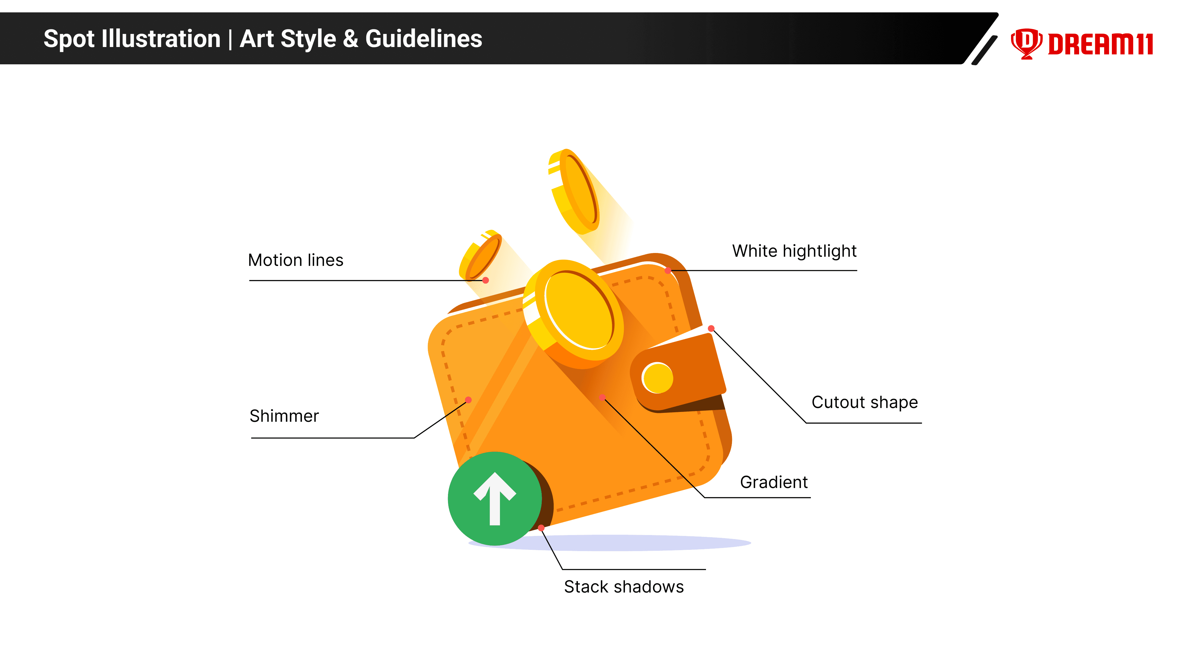
- Art Style & Guidelines
Light source consistently from the top-left
A shimmer at 45° visible on all flat surfaces (except round shapes and fabrics)
Cutout shapes aligned with the sporty aesthetic inspired by the Dream11 logo
Gradients used to communicate drop shadow, depth, or a sense of motion
Overlapping objects cast a stack shadow onto the object behind them
Motion gradients blend seamlessly with the background for a cohesive visual effect

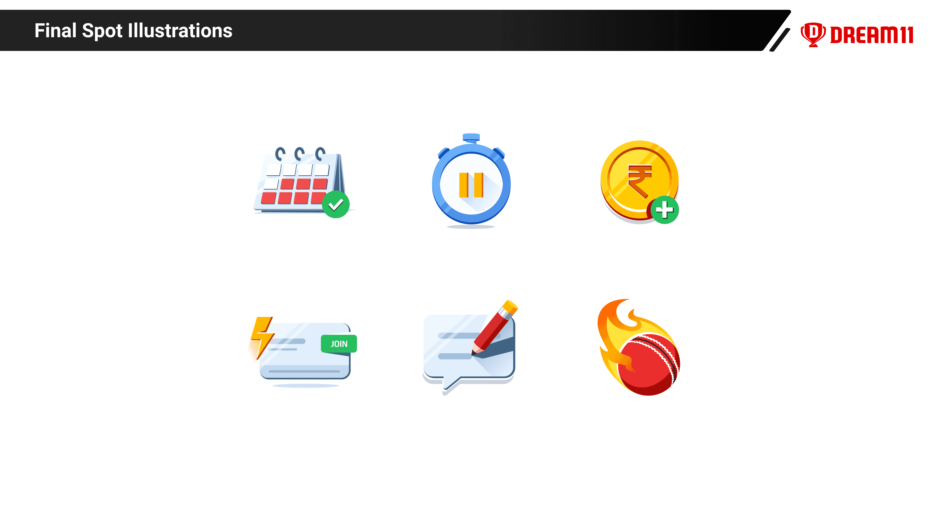
3. Size Specifications

Icons | Spot Illustrations | Hero Illustrations |
|---|---|---|
24x24 px | 80×80 px | Large: 288×288 px |
20x20 px | 72x72 px | Medium: 200x200 px |
16x16 px | 64x64 px | |
56x56 px | ||
48x48 px | ||
40x40 px | ||
32x32 px |
Icons above 32px maintain the same level of detail as spot illustrations. Below 32px, detailing is intentionally reduced to preserve clarity at smaller sizes.
The Impact
The new illustration system resolved both the strategic and user-facing gaps that had built up over time — from ambiguous error states during IPL to the absence of a scalable, team-independent visual language.
Dimension | Outcome |
|---|---|
Contextual Clarity | Scenario-specific visuals replaced generic, reused ones — reducing confusion at scale, especially during peak traffic. |
System Scalability | Tokenised Figma library enabling teams to extend the system independently — no illustrator dependency. |
Cross-team Adoption | Adopted org-wide as the visual standard for all new feature work. |